Thursday, November 29, 2012

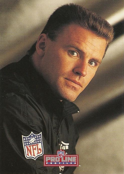
Howie All Doing Today?


1992 Pro Line Profiles #396

Everybody good?


(Say yes and he'll go away)

Um...........


(You fool!)

Yes sir! We're all good!


(Please, make him go away!)

Are we?


Yes! Yes! We're all good! It's good!

(Wets self)


GOOD! SEE YOU BOYS TOMORROW!!

(oh god! oh god! oh god!)


That boy scares the crap out of me sometimes!

(I know, Jimmy)


HOW'S IT GOIN', BOYS!!
 (AAAAAHHHHHHHHHHHHHHHHHHHHHHHHHHHHHHHHH!!!!!!!!!!!!!!!)


Howie must have just been here. I feel their pain. There innocence is lost.....forever.

I am so glad I'm doing this show. That could have been me with those guys!

But seriously, Howie's freaky. Especially when he smiles:


Nope! Nope! Nope! Nope!

Wednesday, November 28, 2012

Topps Without Borders-2001

I am removing the borders from the Topps designs year by year.

This time it is 2001.

With border:


And with a minimized border:


Doesn't really do much to the design, except make the photo bigger.

I like the regular design better. A different kind of color than 2002 Topps, which is a very good thing. I mentioned in the 2002 post how much I hate that set.

Side by side:


Up next, another good looking set, 2000 Topps.

Once again I'll mention how much I hate the 2002 Topps set.

Thanks for reading.

Tuesday, November 27, 2012

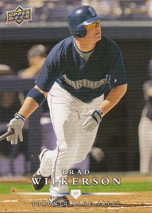
Confusing Card Is Confusing

2008 Upper Deck First Edition Update #469

Hi! I'm Brad Wilkerson of the Seattle Marin........................


....of the Toronto Blue Ja..............


...of the Texas Rangers and I'm hear to tell you about the great state of......

...uh.....honey, what state are we in?


Here's how he got to be......wherever he got to be:

Monday, November 26, 2012

Topps Without Borders-2002

I am removing the borders from the Topps designs year by year.

This time it is 2002.

I hate this set.

With border:


And without(for the most part):


Not that it's a bad thing, but this set seems like it should be a team set design for the Giants. How cool would that have been if 2002 Topps was color coded to each team?

A lot cooler than it actually was.

I hate this set.

Yes, we know it is 2002 Topps! Did you have to plaster it on the front?

Without most of the putrid border the set looks fabulous! Not really, but since it is 2002 Topps, yes, it looks fabulous!

Here in all its resplendent glory, is 2002 Topps in side by side mode:


Did I mention that I hate this set?

Up next, a much better color choice, 2001 Topps.


Thanks for reading this post about this awful set.

Saturday, November 24, 2012

I'm R.A. Dickey!

R.A. Powers

I throw a knuckle ball!

I climbed to the top of a really big mountain!

I won the Cy Young!

I'm really shiny!

I have a baseball! I'm gonna give it to you right now!

I have a mullet!

I play for the Mets!...................yeah, I play for the Mets.

Darn it. I was so amped up about my life 'til I remembered where I play.

Topps Without Borders-2003

I am removing the borders from the Topps designs year by year.

This time it is 2003.

With border:


2003 Topps #T166

And with a minimized border:


I kind of like it the new way but, to tell you the truth, the set is great with the blue border anyways.

Since it also honors 1983 Topps with the smaller portrait pic there is not much to not like about this great set. And the Chrome version is gorgeous as well.

Here's the design without any border:


 Bleh.

Here are the side by side comparisons:


Up next, going from one of the best designs of the '00s to one of the worst, 2002 Topps.

Thanks for reading.

Go On An Adventure.......

..........just by going here:

ADVENTURES IN 1952 TOPPS


I'm really looking forward to the building, and ultimately, the completion of this awesome project.

Now, if only I could find a purpose for my blog.

Friday, November 16, 2012

Billy Herman was a Beast!

Check out this 1993 Ted Williams Card Company Billy Herman card:

#21
I knew he was a Hall of Famer who was a great fielder with a very solid bat, but I didn't know it was this solid:


Wow! Check out those HRs, RBIs, and AVGs.

He was killing it!

Wait a second.....Bos-A? I thought he was a Cub.

He was.

Those numbers just happen to belong to some guy named Williams:


No, not the homeless dude.

This one:


Yeah, that one.

Looks like the intern at Ted's Card Co. wasn't very knowledgeable about baseball.

But to their credit, the internet wasn't really the internet yet.

I liked how that set listed the top 5 years of the card subject's career.

Here are Billy Herman's numbers: NUMBERS

Pretty solid hitting, just not quite the stats listed on his card.

Piles of Schmidt

Picked all these pieces of Schmidt up on Listia a while ago:

10 1989 Fleer Update

25 1989 Topps

50 1988 Topps

50 1987 Topps

I spent around 650 credits on all that Schmidt.

Good deal for all that Schmidt.


Schmidt yeah!!.....okay, I'm done.

Tuesday, November 13, 2012

2012 Topps Oddity

I got these two cards in the same pack recently:

2012 Topps Nathan Eovaldi

Gold Cognac sparkle version

That's not the odd part though.

It's the backs:


Regular Back

Cognac Gold Back

You might not be able to see it here, but the Gold Cognac back is faded and yellow.

It looks like the gold foil or the adhesive leaked all the way through to the back of the card.

Grab some of your own regular and gold cards and compare them.

Maybe Topps used a totally different stock on each kind of card?

Who knows. Just thought it was odd.


See it yet?


Sunday, November 11, 2012

Hey Tom, Whatcha Been Doing?

Hey there, Tom, haven't seen you in a while!

2012 Topps Tom Wilhelmsen

Whatcha been up to?


You just kind of dropped off the end of the world for a bit, didn't you?


(Tom makes up some stuff to get out of the conversation).

Well, see you when I see you.

Oh, here's where you were.

You should move to Colorado or Washington, Tom. I hear they don't mind that kind of thing.

Drugs suck, kids! (End of psa).

Remind me again why alcohol is legal? And a plant isn't?

Friday, November 9, 2012

Topps Without Borders-2004

I am removing the borders from the Topps designs year by year.

This time it is 2004.

With border:


2004 Topps Mike Mussina

 And now with a smaller border:


Well, I'm split on this one.

Photo dominates the new look, yet, the rest of the elements of the design seem crowded together.

I think if it had been released like this collectors might not have cared. I happen to like this set. Not as much as the set coming in the next post on this series though.

Moose is my fourth favorite Yankees player ever, right behind Bernie, Mo, and Donny Baseball.

Side by side:


I'm going to take a wild guess and say that 2003 Topps is next.

Thanks for reading.


www.listia.com more free stuff on Listia